SpotOn
Design Team
Liza Mikula (Product Designer) Anton Reva (Product Designer) Olha Furmanchuk (Product Designer) Marianna Bondarchuk (Product Designer)
Design Team Goals
1. Reduce taps and swipes 2. Enhance customer satisfaction 3. Improve the UX of placing orders 4. Enhance navigation
Services
User Research OOUX Visual Concept & UI Design Design System
Problem
Target Audience
Waiters
Use the POS to create and process orders
Managers and owners
Use the POS to create and edit dishes or items
Discover
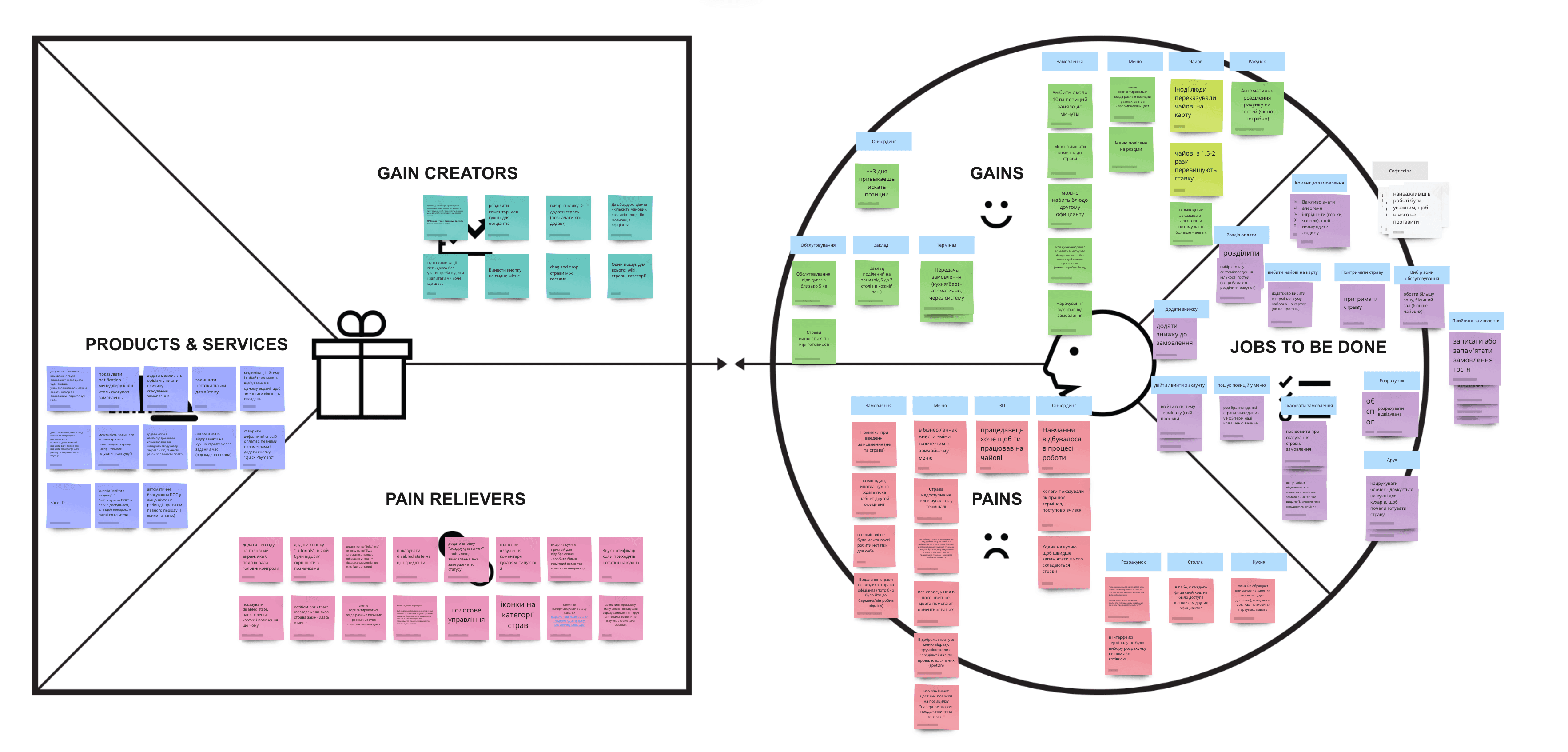
During the discovery phase, we: - Conducted in-depth interviews with the target audience; - Studied the business process model; - Utilized OOUX to comprehend the current information architecture and develop a new one.
Define
Solution
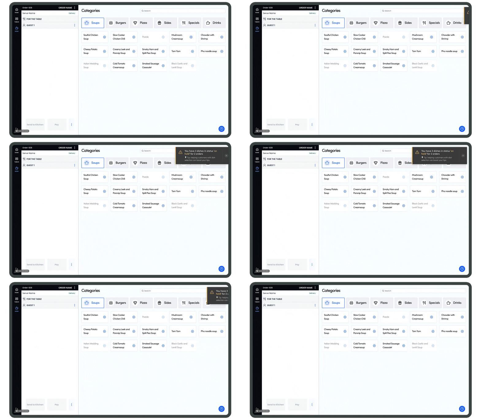
Notification System
There is no notification function for waiters. Waiters frequently forget about tasks without notifications, it can lead to customer dissatisfaction, inefficiency, disorganization, and communication breakdowns within the restaurant.
Our solution involved the creation of a notification system for waiters, aimed at streamlining operations, enabling swift customer service, and ensuring they stay informed about tasks like order readiness, customer requests, seating arrangements, and shift changes.
🎯 We will be right if implementing a robust notification system helps to mitigate problems and improve the overall quality of service.
Before
After
Built from the Ground Up: A Comprehensive Onboarding Experience
Waiters often have questions when they begin using the POS system, and navigating the new interface can be challenging for them.
We've created a brief onboarding guide for the key functions of the POS system, designed for use by new waiters in their initial days of work. If a waiter forgets anything, the onboarding guide is always easily accessible via a prominent button at the bottom of the screen.
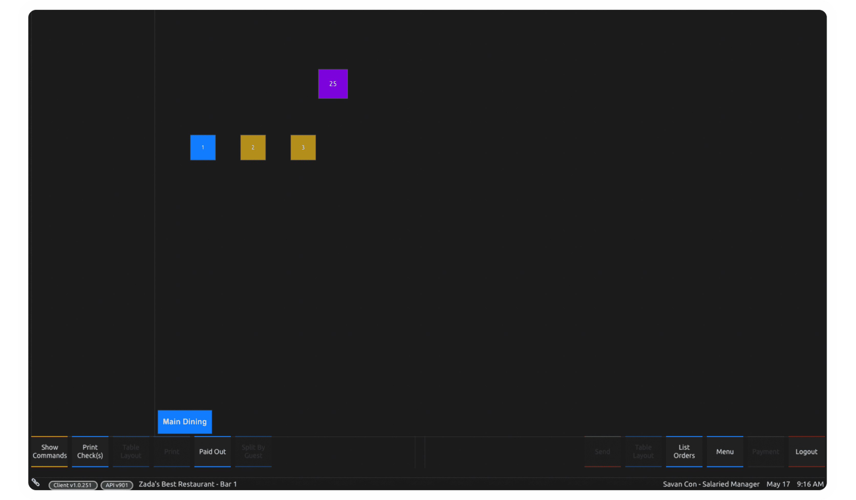
Reorginized Tables View
Users struggle to recognize the association between orders and tables in the Tables section. As a result, they constantly switch between sections to see all orders. This increases the cognitive load.
We've redesigned the tables view, resulting in the following improvements:
Enhanced visibility of orders, making them visually tied to specific tables;
Quick identification of available and occupied tables;
Improved work efficiency, allowing for easier task completion.
🎯 We will be right if the usage of the tables tab will speed up the creation of the order by 15%.
Before
After
Customization
Users experience low contrast when working with the terminal on sunny days. This poses challenges for people with disabilities, who may struggle to work effectively.
We've introduced customization that:
Allows users to personalize the interface based on their preferences
Enhances navigation
Improves work efficiency, making task completion easier and more efficient.
🎯 We will be right if the selection of dishes in the order will speed up by 10%, and the feature will be in demand among newcomers.
Before
After
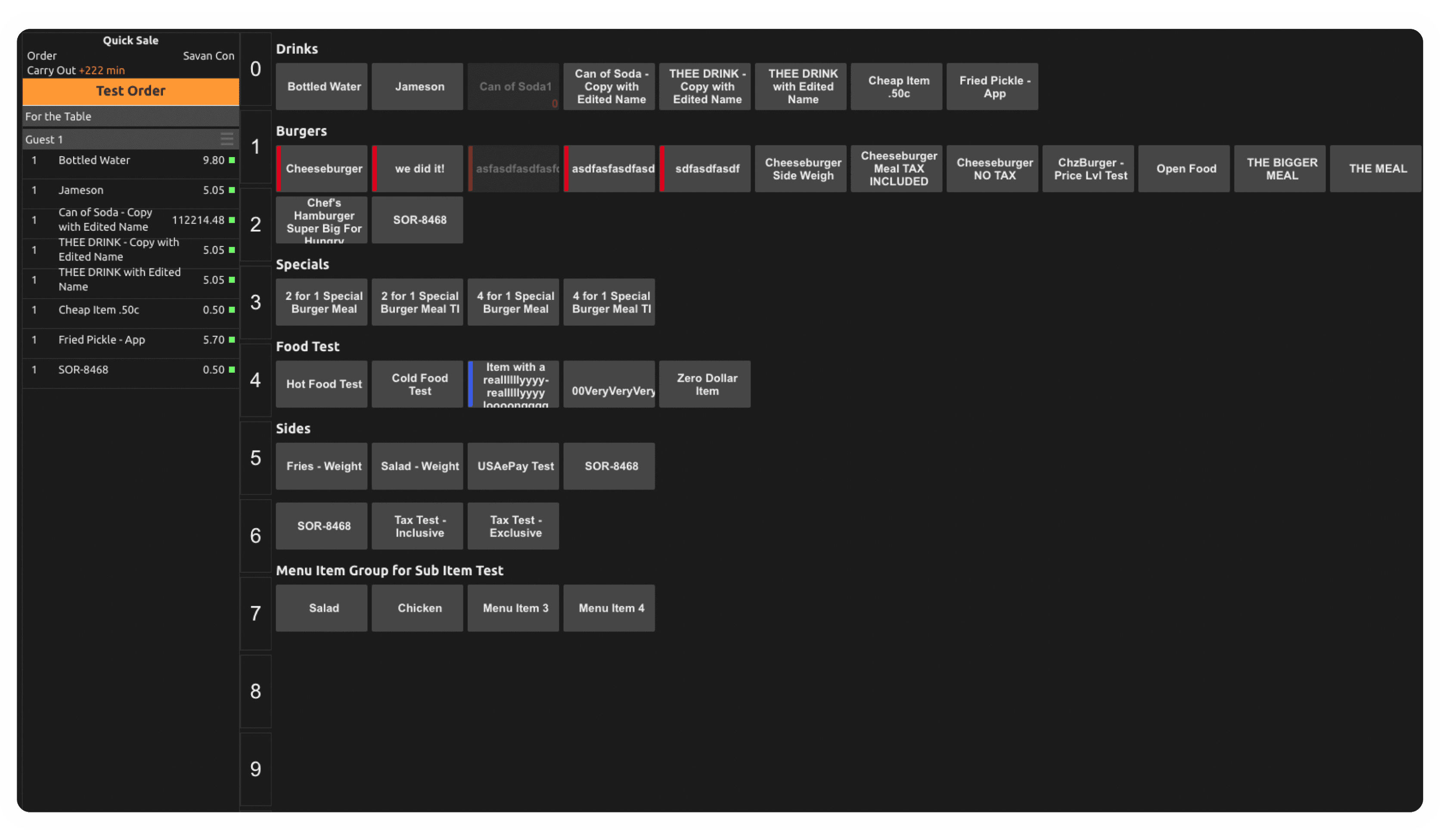
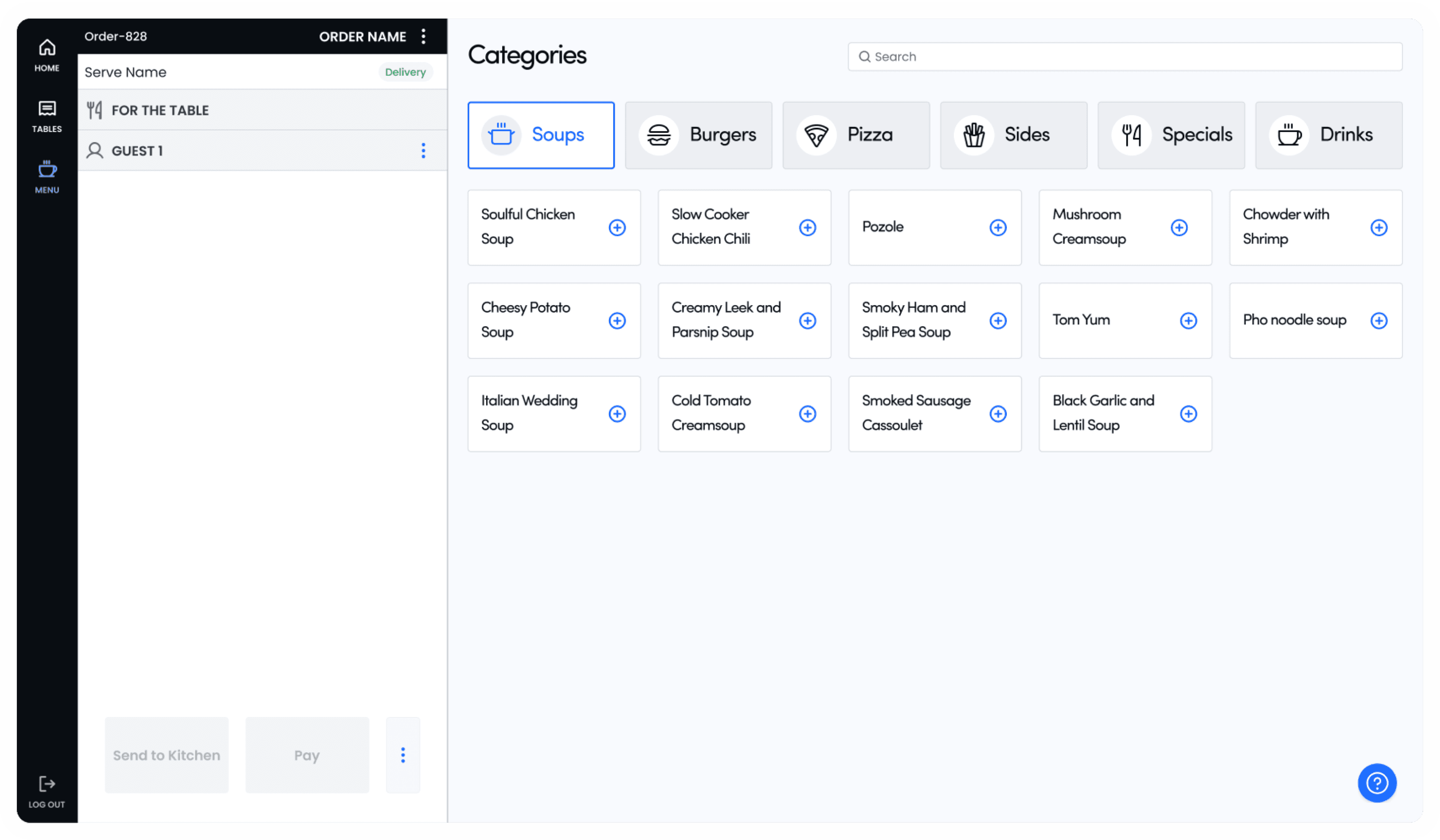
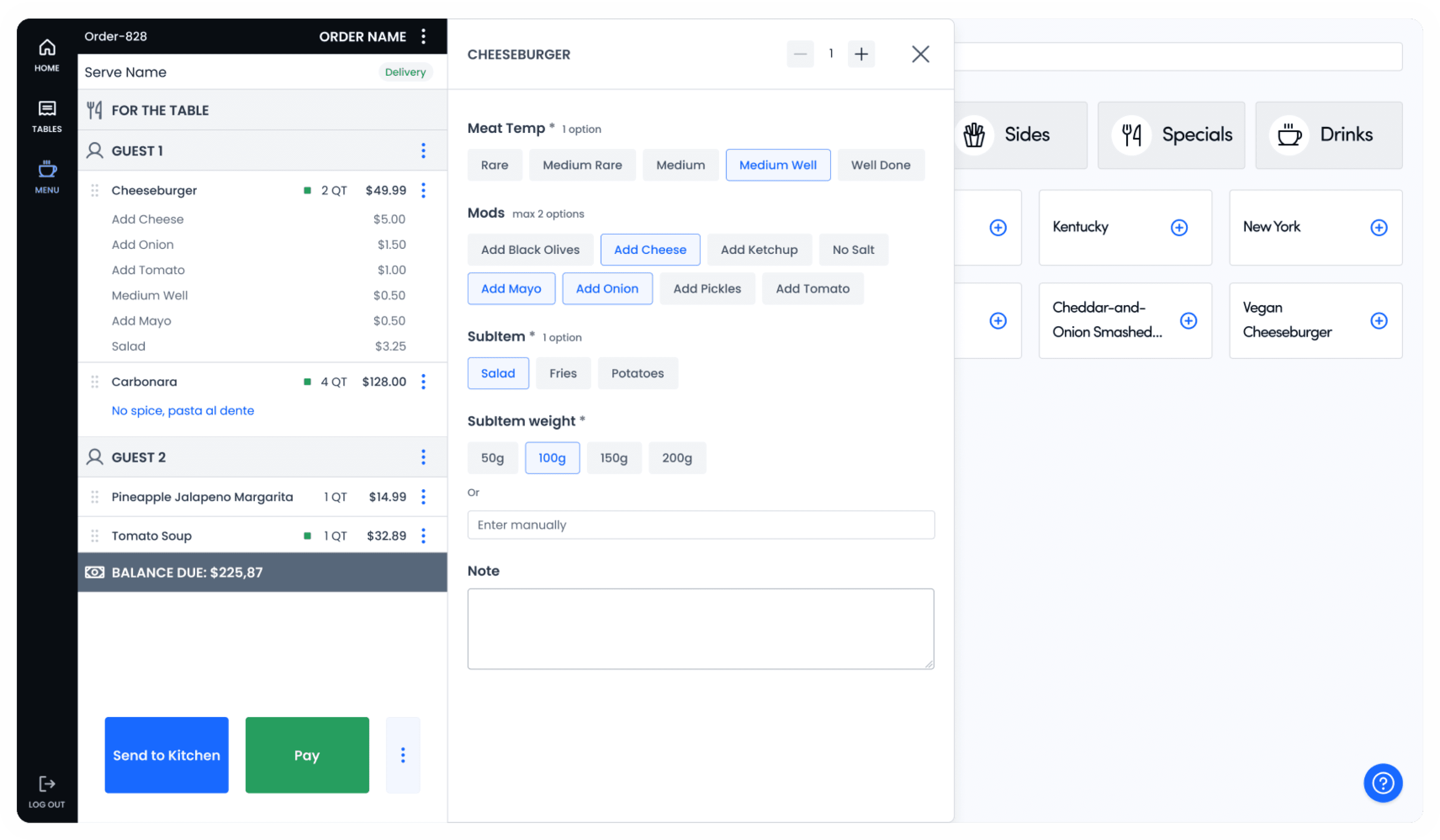
Reorginized Menu Page
The current menu page is overly cluttered, increasing cognitive load for users. The abundance of information on the screen makes it challenging for users to locate the sections they need.
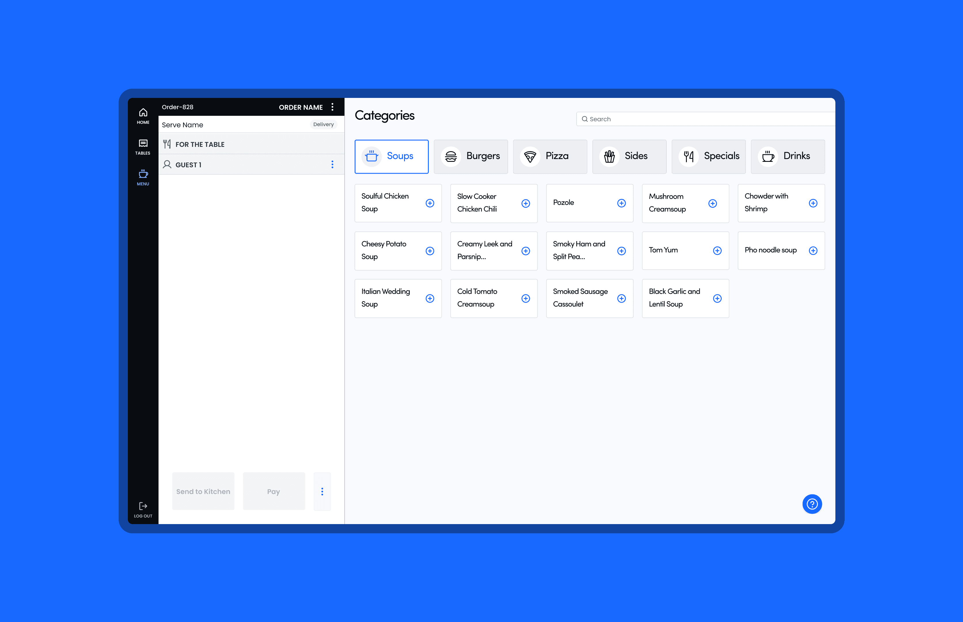
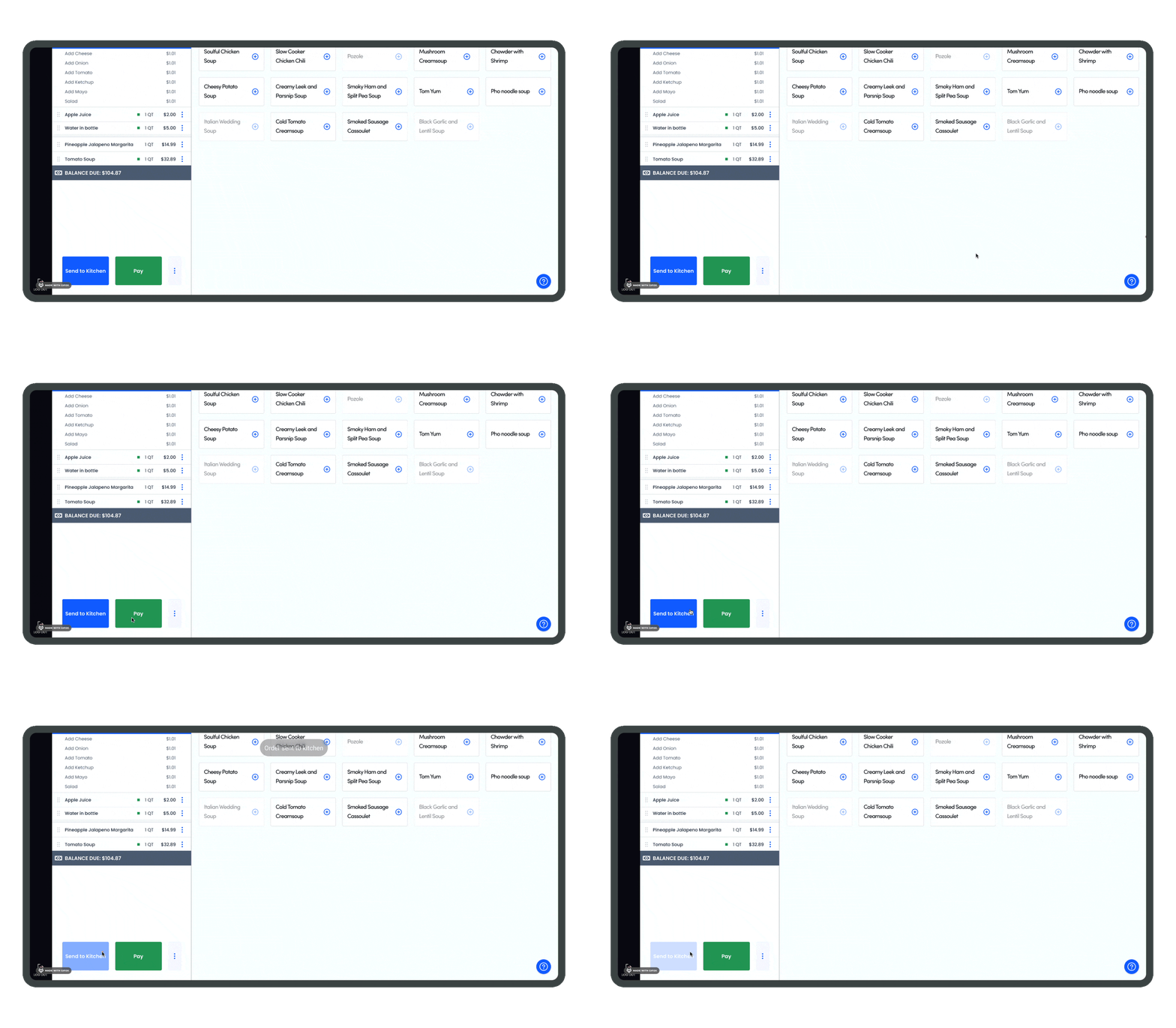
We have redesigned the menu page to provide clear category distinctions, with dishes from each category only appearing upon the waiter's request.
Additionally, when a waiter adds a dish to the check, all supplementary information will appear in a sidebar for easy access, allowing for a seamless return to the main menu with just one tap.
Before
After
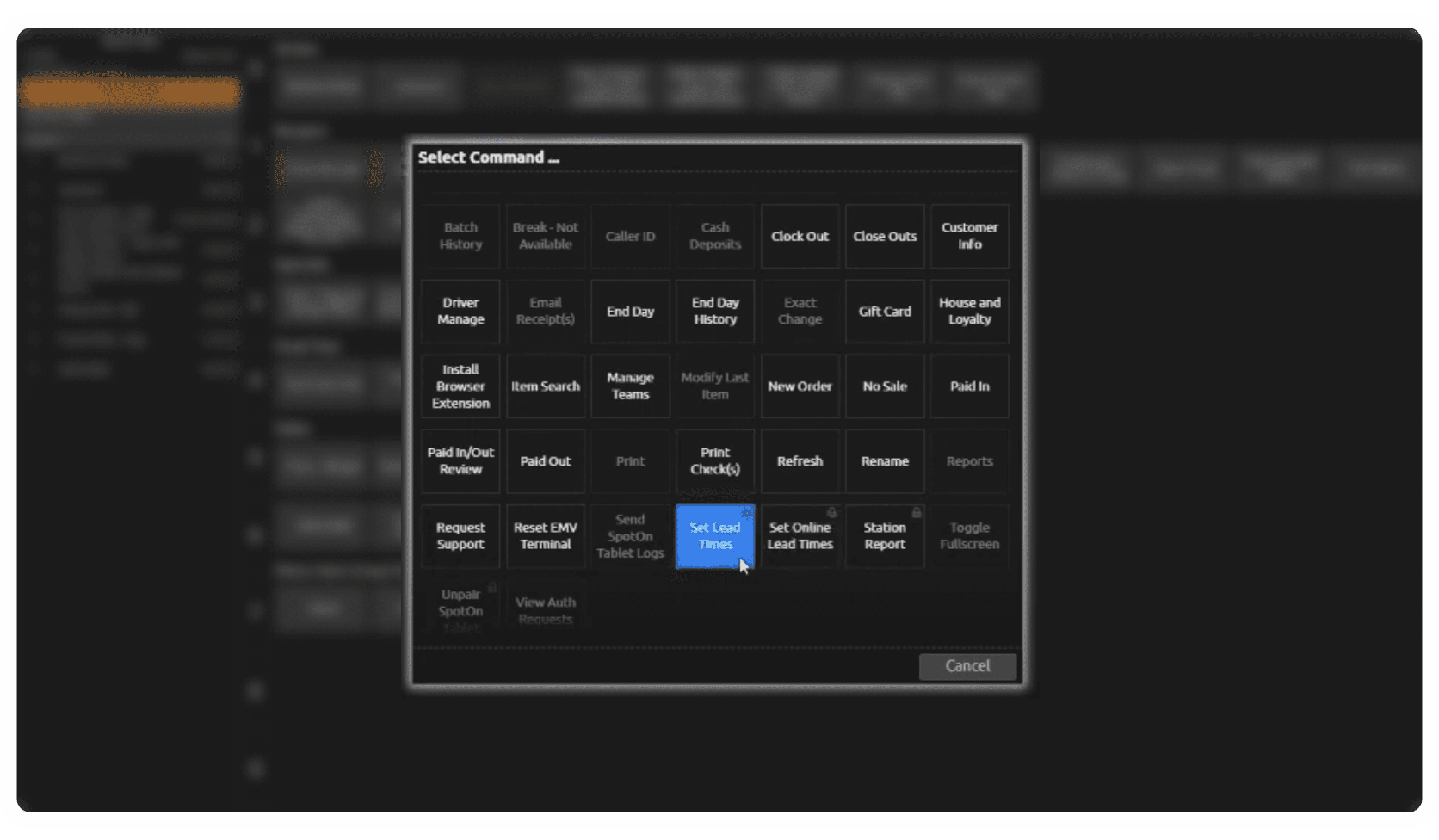
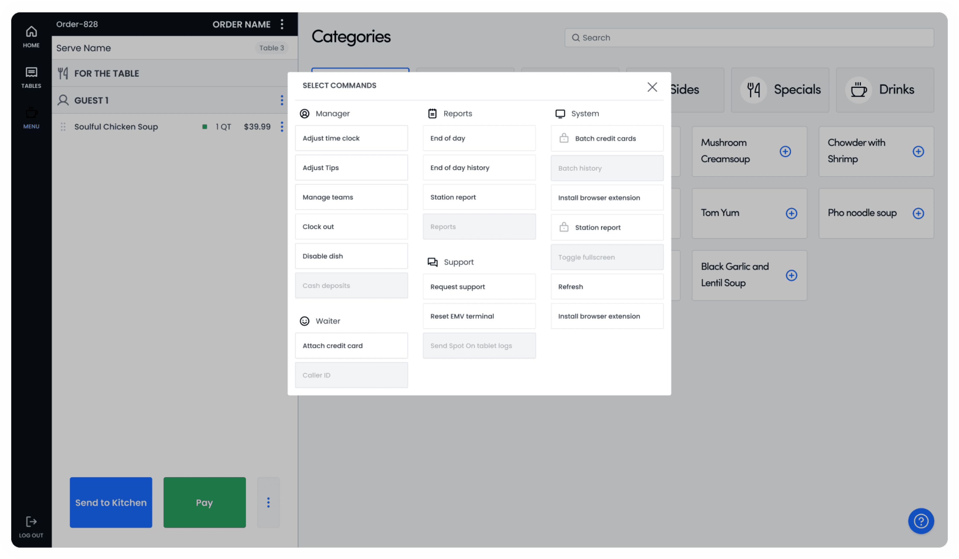
Revised Сommands
The system has many ungrouped commands, making comprehending and recalling all the available actions challenging.
Categorizing actions within the system delivers the following benefits to waiters:
Enhanced organization;
Clearer prioritization;
Improved efficiency;
Reduced cognitive load.
🎯 We will be right if these benefits lead to a smoother workflow and better service quality for customers.
Before
After
Ultimately, stakeholders selected our team as the winner to pilot our ideas.
